
A Largely Casual Review of the Sailor 1911 Large Casual
Ain't nothin' casual about this pen

Sailor make some of the best looking pens on the market—which honestly isn't too hard when you release 20 million colour combinations every year—but those looks come at a fairly hefty price. For a long time, if you wanted a large-bodied 1911 you would need to pay between £300-£500 for something in their standard nib range. For this price you get their 21k gold nib1 with it's famous pencil-like feedback. But what if you could get a similar experience for a third of the price?
A Casual Acquaintance
Enter the 1911 Large Casual!
The Casual line is a bridge between the steel nibbed Pro-Color 500/Shikiori/Fasciner models and the 14k gold-nibbed 1911 Light/Standard2. The standard Casual model has been around since at least 2021, and at the end of last year Sailor surprised us with the Large Casual, both fitted with steel nibs. The standard Casual's nib is along the same lines as the Pro-Colour 500 and its offspring, and is made to look similar to Sailor's current gold nibs. The Large model's nib is about the same size as the 21k nib, but is a much plainer affair modelled after the old version of Sailor's nibs from back before they had the feedback we know and love today. Those nibs sported a much more minimalist design, with a border reminiscent of Heinz ketchup labels. Instead of imprinting the design like on those older nibs, the new nib is laser engraved in a similar way to certain special edition nibs like on the Pro Gear Mini Mouette. But that's not the only difference between the Casual nibs. The Large's nib is a new design, apparently made to feel just like its golden brethren. That's a tall ask. Does it manage to pull this off? Well, before we answer that, lets look at some of the details.
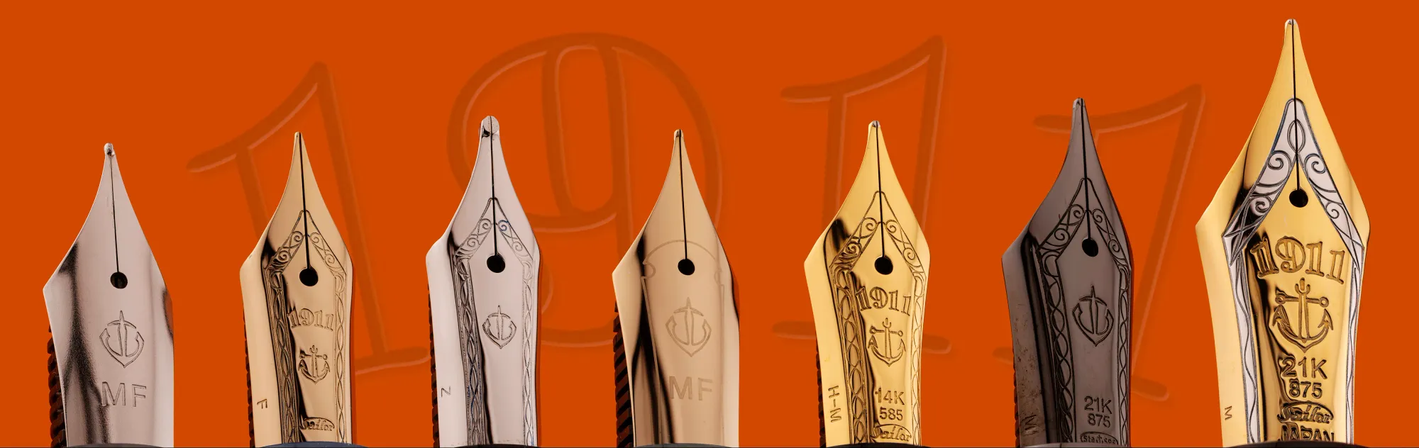
The Large Casual dismantled and compared to the 1911 L Black Lustre
The Details
Dimensions-wise, the Large Casual is essentially the same size and style as the Ringless 1911 L, with the L getting an extra couple of millimetres in uncapped length thanks to its gold nib being a smidge larger.
- Length: 140.8mm capped | 121.5mm uncapped | 151.2mm posted
- Width: 13.3mm body | 15.6mm cap | 11.6-10.5mm section
- Weight (Inked): 23.4g capped | 16.0g uncapped
The material is what I'd call semi-semi-translucent. For the most part the pen looks completely opaque, but once you uncap you start to see the slight translucency in the section and cap. It comes in 4 muted colours, with this one being muted green. I'd like to see them add more interesting colours in the future, but I am quite fond of this shade.
Edit: There is also now a Large Casual Stable in the style of the classic ringed 1911 L with a metal section, along with a new version of the gorgeous ringless Galaxy models, both using the new steel nib. I don't know about the prices for the Galaxy Series as they don't appear to have made it to stores as yet, but the Stable models seem to be shockingly priced at twice that of the base Large Casual.
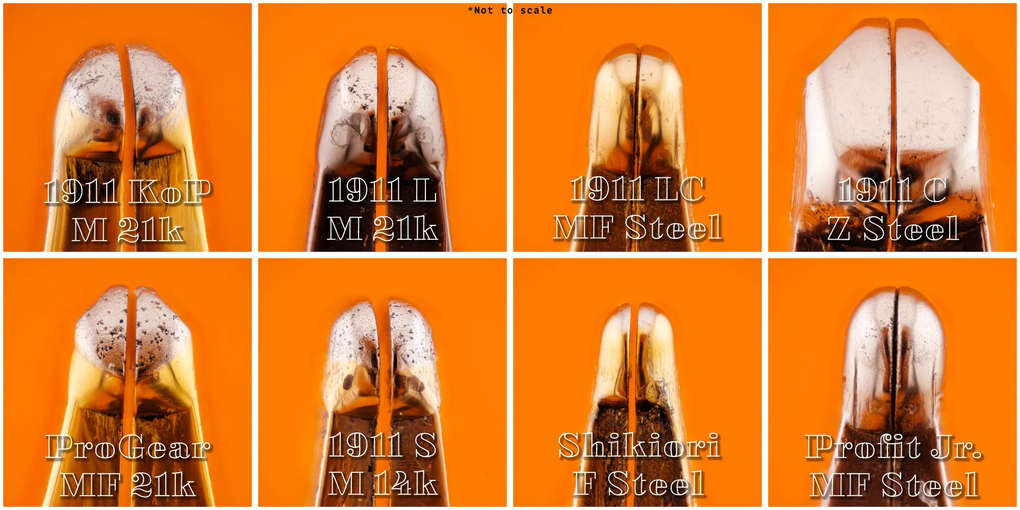
The nib sizes are a touch more limited on the Large Casual than on the other 1911's from the Casual up, ranging from Extra Fine through to Broad, but missing out the more specialist Zoom and Music grinds. I decided to go with the Medium Fine so that I can more closely compare it to the 21k Medium Fine in my Pro Gear Fika II. For anyone who was hoping you could transplant the gold nib into the Large Casual, this is unfortunately not possible. The 2 nibs have completely different geometries, with the steel nib being much flatter and a bit shorter than the gold. The nib housing on the Large Casual is-shaped like a heater shield rather than circular with a flat bottom. It's essentially the same as the Profit Junior and Fude de Mannen's nib setup—because it's exactly the same nib, with a feed that has a slightly different profile. Well... I say it's exactly the same, there is one major difference: How it writes.
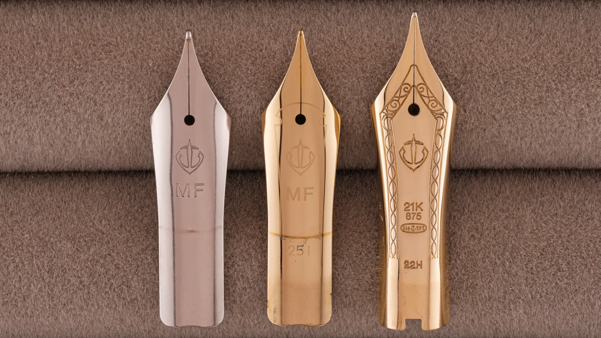
Profit Jr. > Large Casual > L/Pro Gear nib comparison | Large Casual feed (top), Profit Jr. feed (bottom) | Impression of the nib housings for the Large Casual and L/Pro Gear
Gold vs. Steel
Now for the all-important question: Does this new steel nib really feel like gold? To answer this, we need to talk about the perceived difference between gold and steel nibs, at least in modern pens. This can be quite a contentious topic. The main differences people cite are that gold nibs are smoother and softer, with some bounce or flex to them. This it true for the most part, but there is some nuance here. Yes, they can be smoother, and they can be softer, bouncier, and more flexible. But... It primarily depends on two things: how the tipping has been finished and the physical geometry of the nib. There are steel nibs that are very flexible and there are gold nibs that are as stiff nails, largely thanks to the way the nib has been designed and cut. The specific material composition does obviously have an effect on how much it can deform and still go back to the original shape, which is what makes a nib feel soft or flexible. It's easier to make a bouncy gold nib than a steel one, but the fact that a nib is gold or steel doesn't inherently mean it will or wont behave in this way.
The same goes for tipping. There are steel nibs that are exceptionally smooth, and gold nibs with tonnes of feedback, or that are even scratchy out of the box. Keep in mind that—other than with stubs or other nibs that are untipped—the material your nib is made from isn't what is in contact with the paper. That's the job of the tipping that's spot-welded onto the nib during manufacture, which is then ground down to the finished shape and size. This tipping is usually an alloy made up of durable and wear-resistant metals in the platinum group, like tungsten, ruthenium, and osmium. Contrary to what some nibs claim, iridium is astronomically rare and hasn't been used in tipping for over ¾ of a century, and even then it made up less than 3% of the materials. So what your nib is made from doesn't generally affect how smoothly it writes. With all that said, there is a fairly significant caveat. Since gold nibs are more expensive, they (generally) have more care put in during the grinding and finishing process. This leads to a higher hit-chance of "good" nibs than you'll generally find with cheaper, more mass-produced steel nibs. Again, as with all things, there are exceptions to this with both gold and steel nibs, but it tends to be the case more often than not.
For me, the difference in feel between gold and steel is rather nebulous. Some gold nibs it instantly feels like it's a gold nib, other's you could tell me were actually steel and I would believe you. With that in mind, I could easily be convinced either way when it comes to the Large Casual's nib, and I kinda love it. It doesn't feel anything like the nib in the Profit Junior despite their similarities in shape and size, but I wouldn't really say it feels quite like the 1911 gold nibs either. It's definitely closer to the feel of gold nibs than steel, though. Looking closer at the tipping with an adapted microscope objective reveals some of the differences in finishing. The gold nibs have tiny pits in the tipping, whereas the steel nibs look much smoother. This alone doesn't necessarily translate to how smooth each nib feels, and there are so many variables for how tipping can be ground and polished to determine the feel. Case in point, the tipping on my 1911 Shikiori looks perfectly smooth, but it's a terribly scratchy nib despite the tines being perfectly aligned. I do believe the micro-pits are what give gold Sailor nibs their pencil-like feedback while still providing a smooth writing experience, and why that feedback isn't really seen in their steel nibs. There isn't much of any information about what Sailor uses for the tipping on their gold nibs, unfortunately. I assume the pits are a result of the specific mixture of alloys they use, rather than a finishing technique, but I'm not a specialist in this subject, and unless Sailor decide to reveal their secrets themselves, I doubt we'll ever know for sure.
Final Thoughts
I've been loving my time with the Large Casual and it's been seeing heavy use since I bought it. But would I recommend it to others? Absolutely! I think it sits in a good price point, and if you've been hankering for a 1911 L but unwilling or unable to fork out for a gold nibbed one, the Large Casual is a no brainer. The nib is exceptionally good and along with the larger body size, it makes for an impressive and comfortable writing experience. Now if only they'd make a version in the King of Pen body...
1For now, at least. Due to the constantly rising price of gold these days, the 21k nibs are being replaced with 18k nibs on most 1911 models, including the KoP. The Standard will all be 14k now, with the Large being available in 14k and 18k. Pro Gear models will be unaffected, with the Pro Gear Slim even getting an upgrade from 14k to 21k. How that makes sense, I've no idea.
2The 1911/Profit line is much larger than you may realise. As far as I can tell (not including limited special editions and one-off's), the full line-up is:
- Junior / Compass / Fude de Mannen
- Pro-Color 500 / Shikiori / Fasciner
- Casual
- Large Casual
- Large Casual Galaxy Series
- Large Casual Stable
- Light / Standard (14k/21k)
- Large (18k/21k)
- Demonstrator / Jellyfish
- Ringless / Galaxy
- Black Lustre
- Reallo
- Hard Maple
- Maki-e
- Special Nibs (Naginata Togi etc.)
- King of Pen