
3 Totally Unrelated Pens
A review of 3 completely unrelated fountain pens with absolutely no ulterior motive...

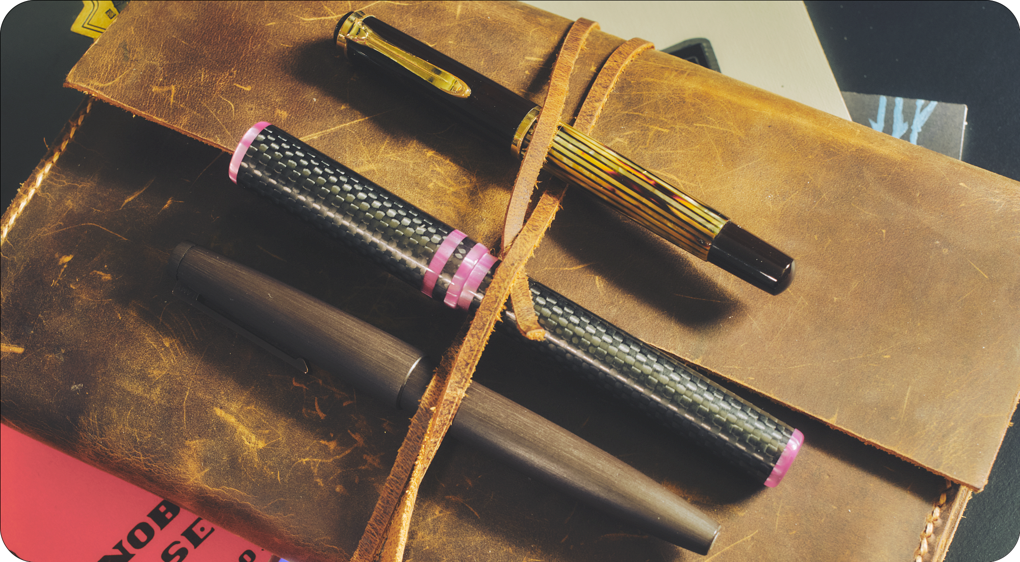
The three pens I'm sharing with you today have basically nothing in common, other than being pens I've been wanting to try out for a while. Just three random pens. Three great pens, to be sure, but totally, 100% unrelated. Yep, nothing in common whatsoever.
Anyway...
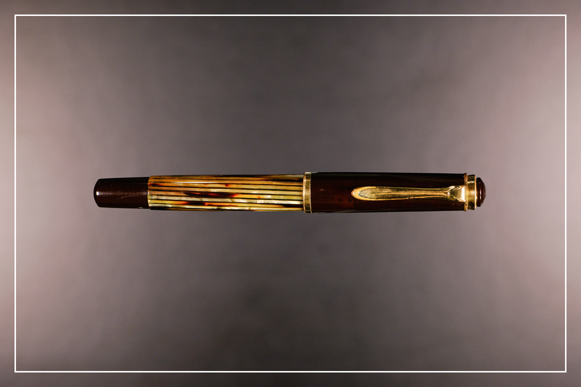
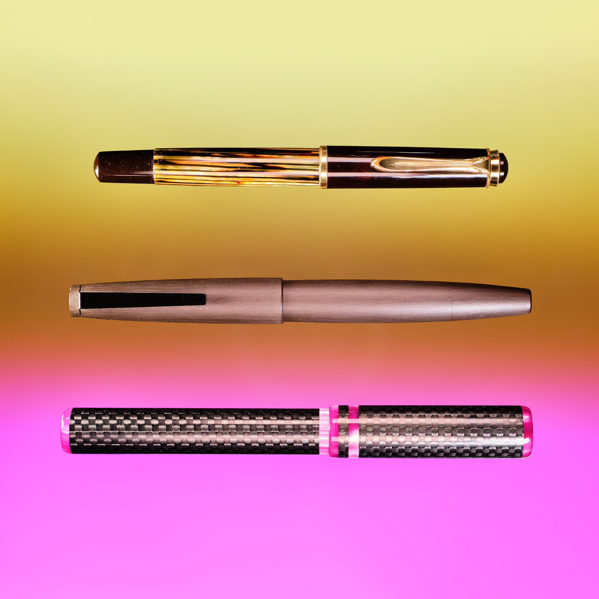
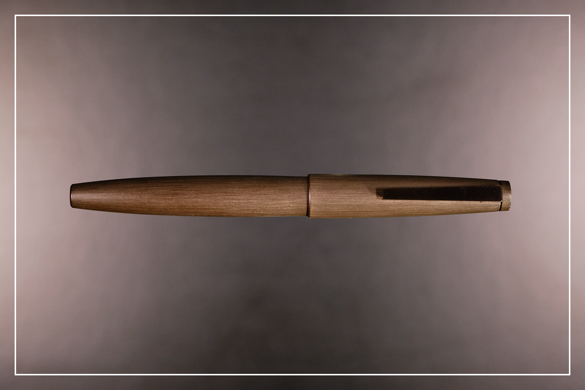
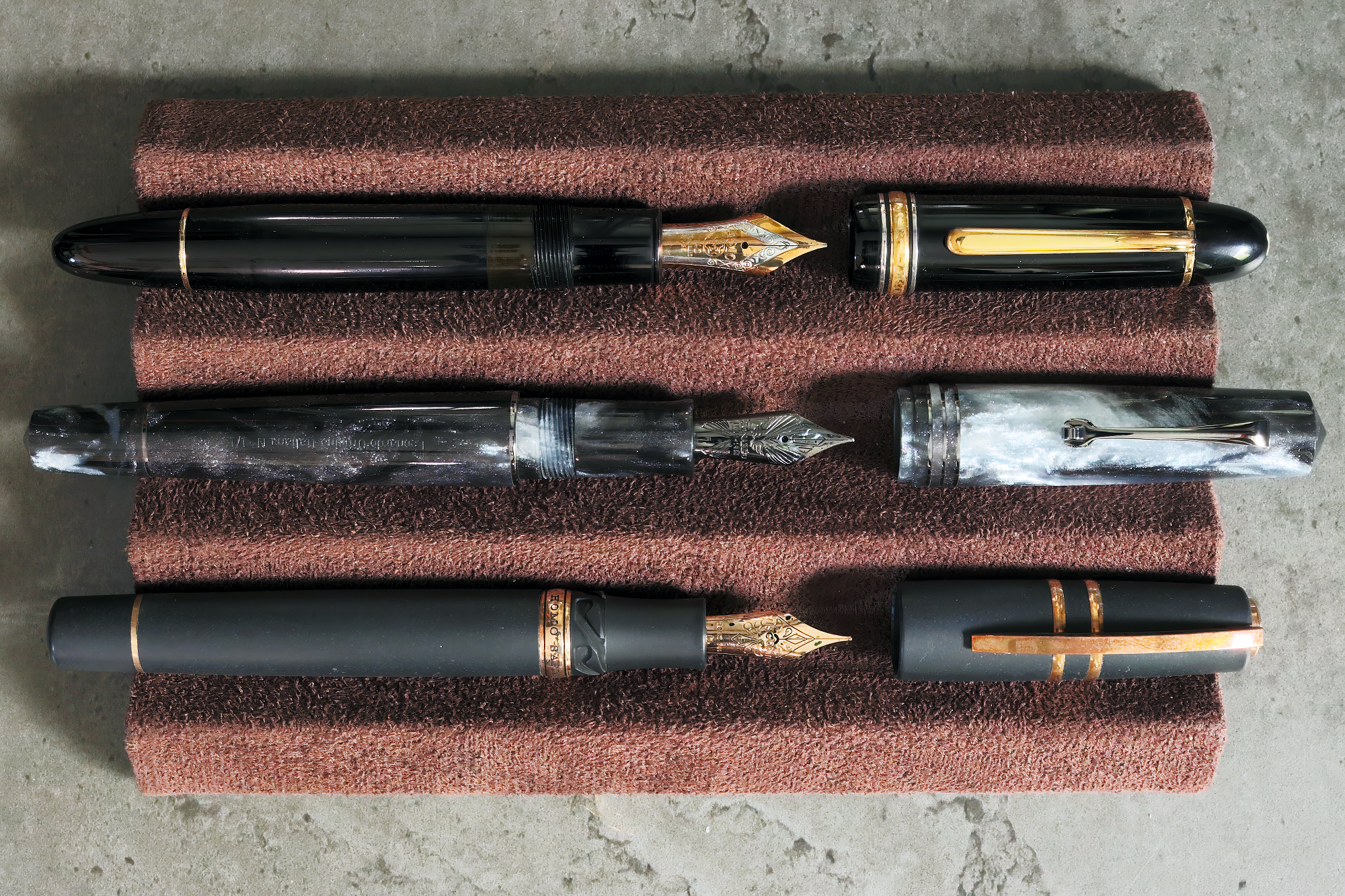
The first pen is a real beauty—a Tortoiseshell Brown vintage Pelikan 400 from the early 1950's. We initially thought it was a 400N, but based on the lack of engraving on the cap band and the nib having script text instead of the logo, as well as slightly different finials, all point to this being an original 400 from between August 1950 and mid-1954. This is my first time using a higher-end Pelikan, and my first experience with their gold nibs—although vintage gold nibs are a very different beast to their modern counterparts. I've been hesitant towards picking up an M200 series pen despite really liking a lot of their designs. As much as I love pocket pens, I've found larger pens are much more comfortable to use, so I was concerned that they would be too small for me. The vintage 400 is surprisingly close in size to the modern M200/400 despite the ~70 year gap between them, so this would be a great opportunity to both see how the size works for me, and to play with a flexy vintage gold nib.
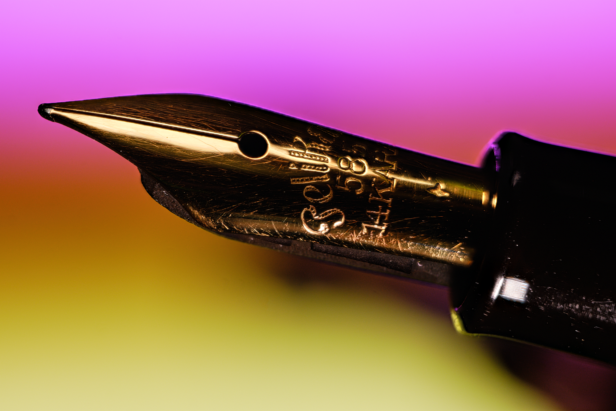
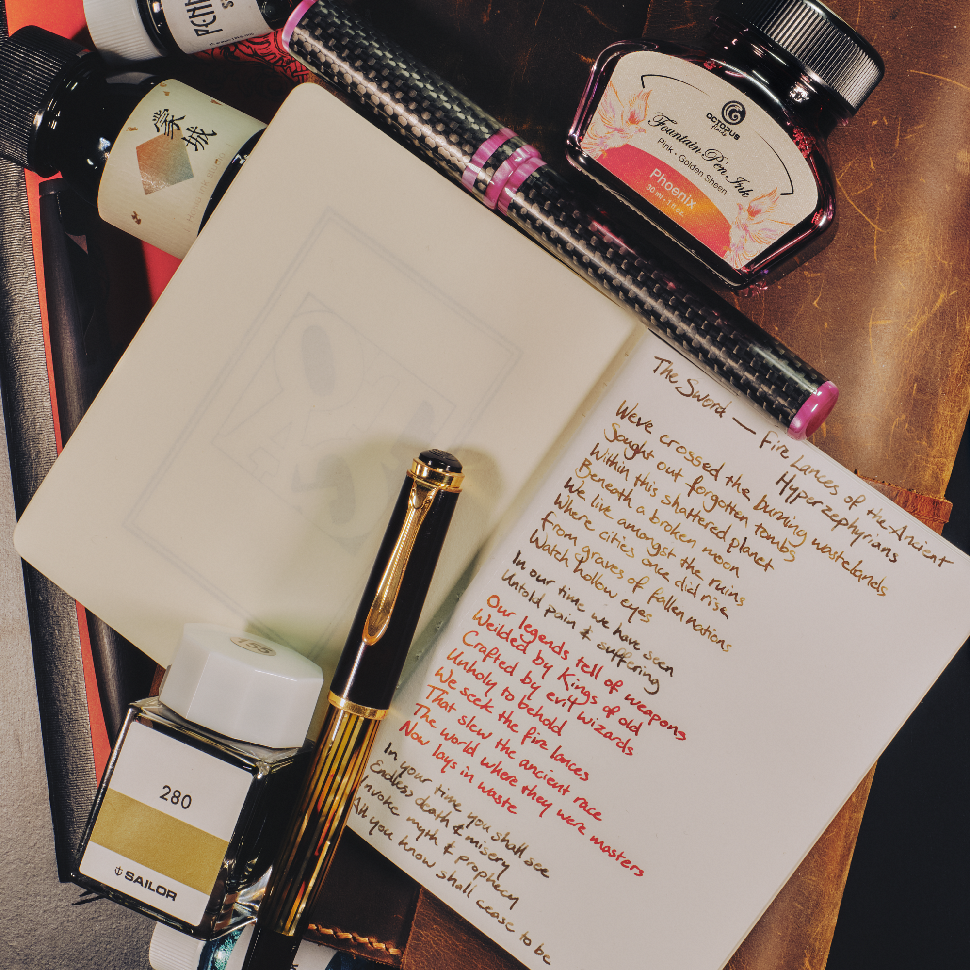
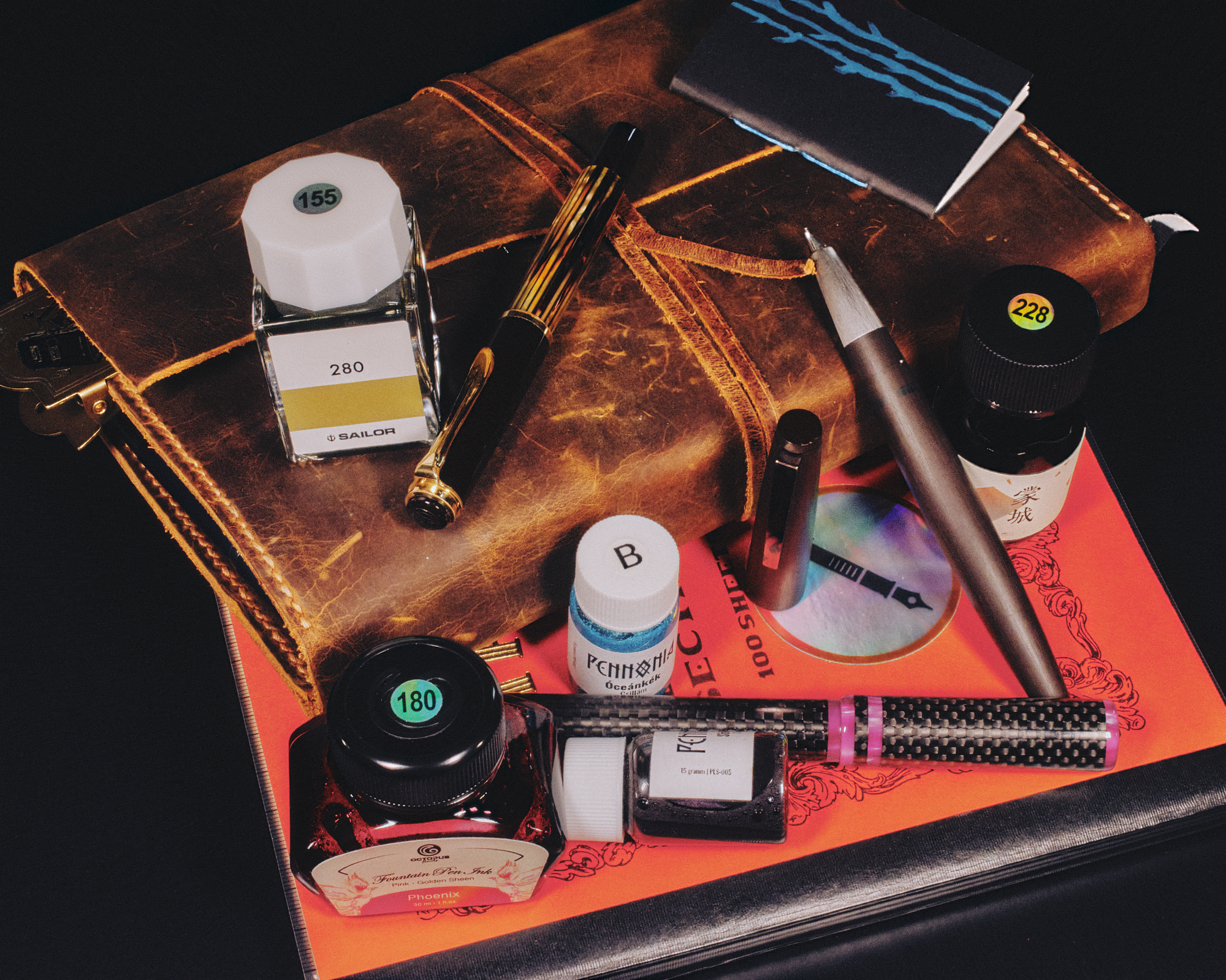
As it's both vintage and a piston-filler (plus 1 other reason, but we'll put a pin in that for now), I didn't want to use any kind of shimmer ink in it. I'm super into chromashading inks at the moment, so I inked it up with Sailor Ink Studios 280—a sandy-yellow with hints of green showing through which matches well with the tortoiseshell stripes. As the 14k gold fine nib is from the early 50's, it's rather flexible. It's not a wet noodle by any means, but it gives a good amount of line variation. There's a bit of feedback when writing, not so much that I'd call it scratchy, but enough for there to be a pleasant audible sound as the nib moves across the page. It's lovely to write with, but it is a touch on the small side for me. After ~20-30 minutes of writing my fingers started hurting, but that's not too bad since that's about the longest I tend to write for at a time. I'm still on the fence with picking up an M200. I now know that, although small, it's not too small. But, I think I'd need to be really in love with a design for me to go for it. So no plans to pick one up at the moment, but I'll be keeping an eye out for that special one.
Next we have another pen that I wasn't sure if it'd be comfortable for me to use, but for a different reason. The Lamy 2000 is a pen that is very highly regarded, but doesn't work for everyone due to the 2 "ears" that stick out either side, which are used to let the cap seat securely in place. These are probably the most contentious part of the pen due to the fact that they get in the way of many people's grip, digging into their fingers. This wasn't a problem for me thanks to my wonky grip, so my fingers were well clear of the ears. I do tend to prefer finger-stops on pen sections so that my fingers don't slide down onto the nib, so I was concerned that the sloping section of the L2K might be an issue, but the Makrolon & brushed steel materials were grippier than expected and my fingers never slipped the whole time I used it.
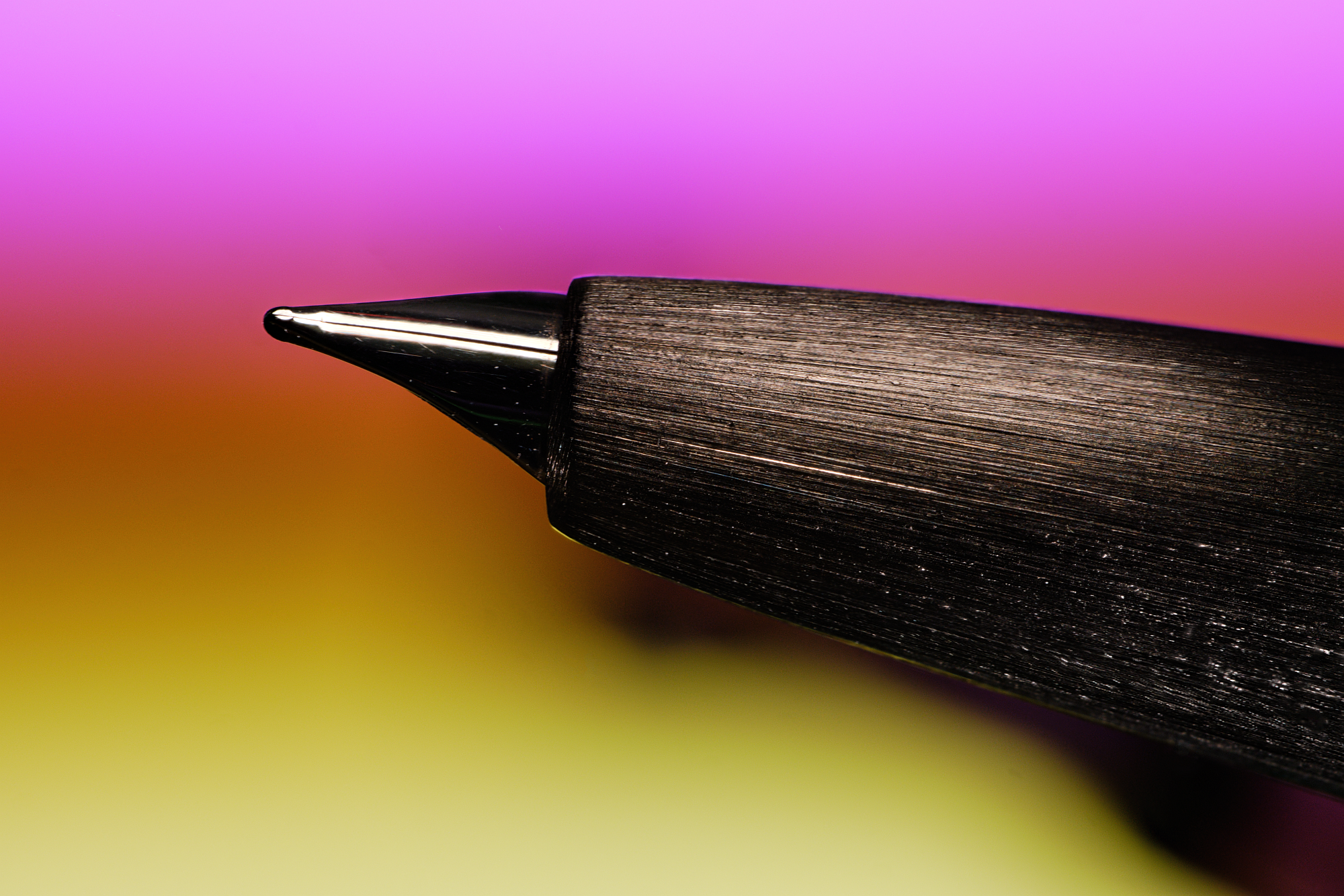
This specific model is the limited edition brown version from Lamy's 55th anniversary. It's a pretty dark brown, so much so that in normal light I forget that it's not the standard black version. The only thing that gives it away is the brown clip, which is brushed steel on the standard version. Again, as this is a piston filler and a rare model (plus 1 more reason, but 🤫) I don't want to use shimmer in it, even though it's easy to disassemble and clean, so I once again opted for a chromashading ink. Hosia Ink Studio Mengchen is a Chinese ink that I recently picked up which consists of a chocolatey-brown with teals & oranges showing through that I thought would work well with this pen. As soon as you start writing with it you realise why this pen is so highly esteemed—beyond the timeless Bauhaus styling. The 14k gold fine nib is beautifully smooth and just wet enough without being a fire-hose, and the thicker body is incredibly comfortable to use, with no finger pain or fatigue past the 30 minute mark. I'm very much in the "L2K is awesome" camp now, whereas I was pretty indifferent towards it before. However, it's not the pen I've enjoyed the most of the three. That accolade goes to...
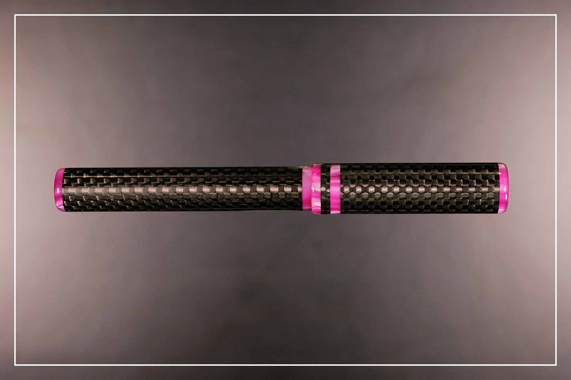
The John Garnham JG6 Carbon Oversized is a pen I came across purely by chance, and I imagine this will likely be a new maker to many of you as well. You wont find his pens in any stores as he only sells them through the Fountain Pens UK Facebook group in very small batches. I am in that group, but I very, very rarely go to facebook these days, so I tend to miss a lot of the stuff going on there. The pen is a smidge longer than the L2K at just over 140mm, but a decent amount thicker at 16mm at its widest point. It's a straight rod for the full length with flat ends that have slightly rounded-off edges. The main part of both the body and the cap are made from carbon fibre, with the finials, cap bands, and the section made from a swirly magenta resin with some lovely chatoyance. The section has a roughly ½mm concave and provides a very comfortable grip. As this is the JG6 model it takes a #6 size Bock 250 nib, in this case a Fine in Titanium. I like Bock's titanium nibs more than their gold or steel nibs. They're very juicy nibs with a little line variation and exceptionally smooth.
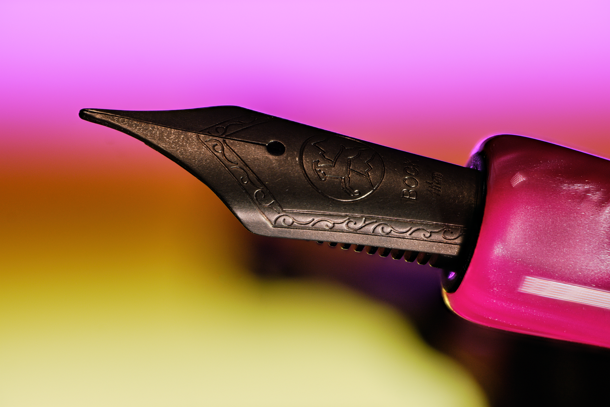
As this is a cartridge/converter pen and can easily be dismantled for cleaning, I decided to use Octopus Fluids Phoenix—a red/pink/orange/gold ink from their Sheen range that defies clear classification. But that wasn't quite enough colours in one ink, so I added Pennonia Óceánkék (Ocean Blue) & Sötélila (Dark Lilac) Csillám shimmer additives to it. Pennonia recommend adding 1 or 2 drops to 5ml of ink, which I did and you wouldn't've even known it was there. I bumped it up to 5 drops of each, which looked more along the lines of what you would normally see in shimmer inks, but unfortunately it still isn't showing up too well. Maybe the monster sheen overpowers it, or maybe it needs a tonne more shimmer. I dunno, I'll experiment with it more another day.
Since the pen is predominately made from carbon fibre, it's exceptionally light at just shy of 20g capped and fully inked, and only 13g with the cap off. This, combined with the larger size and juicy nib means long-form writing is an absolute dream, with zero pain or discomfort when writing with the JG6 even during marathon sessions over multiple hours. I didn't expect this to be the pen I liked most out of the three considering the classics I rented along with it.
Wait... rented? You can rent pens?!
That's right! There was something that linked the 3 pens after all—I rented them! That was the other reason I didn't want to put shimmer ink in the 2 piston fillers. As much as I love shimmer inks, they can cause problems and I don't want to run the risk of damaging these valuable pens when they're not mine to risk.

I suppose the first question is: Why? Why would you want to rent a fountain pen? There are many reasons. I don't have any kind of Pen Club in my area, so I don't have the opportunity to try out pens that I would never be able to afford myself. So I rented a vintage Montblanc 149, a 1 of 1 Leonardo Momento Zero Grande, and a Visconti Homo Sapiens last year for exactly that reason. Another possibility would be to try out a pen before purchasing it, especially if it's near the top-end of your budget. There are no brick & mortar stationery stores near me that I can go to for a hands-on with a pen before buying, which was the reason I rented the pens we looked at today. It doesn't necessarily have to be an expensive pen either, just any pen you fancy trying out.
The next question would be: How? It's taken me 1600 words to get to the true purpose of this post—to introduce PenSharing.com to more people! PenSharing.com is the brainchild of Jon Rabbet, who brought it to the world back in 2018. It was initially a place for people in the UK to share pens with other pen enthusiasts, but has since grown to include networks in the US, Belgium, Norway, & the Netherlands. In Jon's words:
Pensharing was created to enable the pen community to share their love of pens! We're all on the lookout for the next pen, but that doesn't mean you have to buy it. Owners can hire out their pens to fellow enthusiasts and make some money, whilst hirers can enjoy the latest pens for a short time for a fraction of the cost of buying.
You can either hire pens FROM other pen lovers or hire pens TO other pen lovers. But you don't have to hire to others to be able to hire from others - it's up to you!
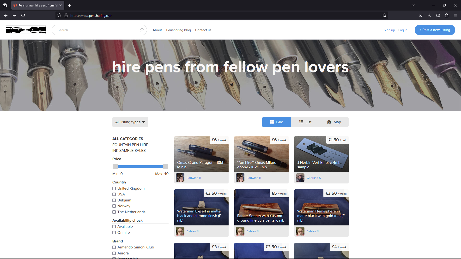
To help keep things secure, the site operates on a members-only system. Membership costs just £12 for a year (this will be going up to £14 on 1st September) with a 3-month free trial, which I feel is extremely reasonable. Pen rentals start from as little as 50p/week for lower value pens, with £20/week being the highest I've seen for Namiki's & the like. Shipping costs vary depending on the value of the pen, and this is something you absolutely do not want to cheap out on. The more expensive the pen, the higher the shipping cost in order to make sure you're covered if something goes wrong during delivery. This is fairly uncommon, but it does happen. People are also usually willing to combine items, so if you're renting more than 1 pen from the same person it works out a bit cheaper.
But pens aren't the only things available on PenSharing.com. It's also an excellent place to get ink samples from! I've been planning to sell samples there for months now, but I still haven't gotten around to it yet. Maybe by this time next year I'll have done it. Maybe...
TL;DR—Visit PenSharing.com! Rent Pens! Hire out your own pens! Buy & sell ink samples!
Is there a pen you'd like to try renting? Do you have any that you'd consider renting out? Let me know in the comments or on Mastodon!