
What the Fude?
What do you get when you cross a fude nib with a music nib? You get a review of the Duke 551 fountain pen!

If you recall from my last post, I might have a teensy-weensy bit of a thing for Chinese pens. Their generally lower pricing makes it easier to take some risks on pens that are a little...different. Some risks pay off, others not so much. I want to share one of the successful ones today. But first, we need to talk about two very different nib styles—Fude & Music.
Various Fude nibs, including the Sailor Fude de Mannen, Jinhao 82 Fluorescence Blue with a blue Kuashilai Fude nib, & the Endless Creator with a Mini-Fude nib.
Fude nibs are kind of weird. They look a bit like the nib has had a rapid interaction with a hard floor, but I promise—they're not broken, they're supposed to look that way. These nibs originated in Japan, and were designed to mimic brush strokes. Their turned up nibs allow you to get different line widths by varying the angle, much in the same way you might with a brush. Depending on the nib, you can usually get line widths from fine or extra-fine all the way up to triple broad all from a single pen. This makes them popular with artists as well as for writing logographic languages like Chinese & Japanese.
Music nibs are also a bit weird, but at least they don't look completely busted. They're similar to stub nibs, but instead of the one slit & two tines you'd see in "normal" nibs, music nibs have two silts & three tines. This makes the nib much wetter and provides an even flow of ink to the entire width of the nib. They also tend to be a bit less square than stubs. These nibs were designed, unsurprisingly, for music notation. Vintage music nibs tended to have some flex to them, but modern music nibs are mostly nails. Unlike with most pens, they're meant to be held at a high angle and perpendicular to the page instead of parallel, which gives wide horizontal lines and very thin vertical lines. I have what you could call a "non-standard" grip, so—other than the high angle—I tend to write that way anyway.
"Why have you been telling us about these two very different nib types?" I hear you ask. Well, what if you were a few sandwiches short of a picnic and decided to meld a Fude nib with a music nib, and then plonk an overfeed on it? You'd get a Musde nib, if you will. Fusic? Musifude? I might need to work on that name a little more.
Anyway... enter, the Duke 551.
The Duke 551
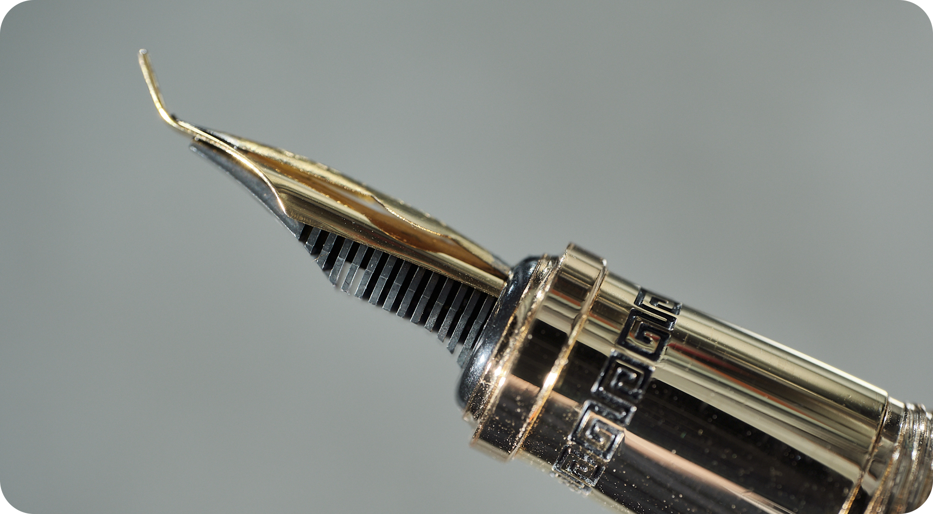
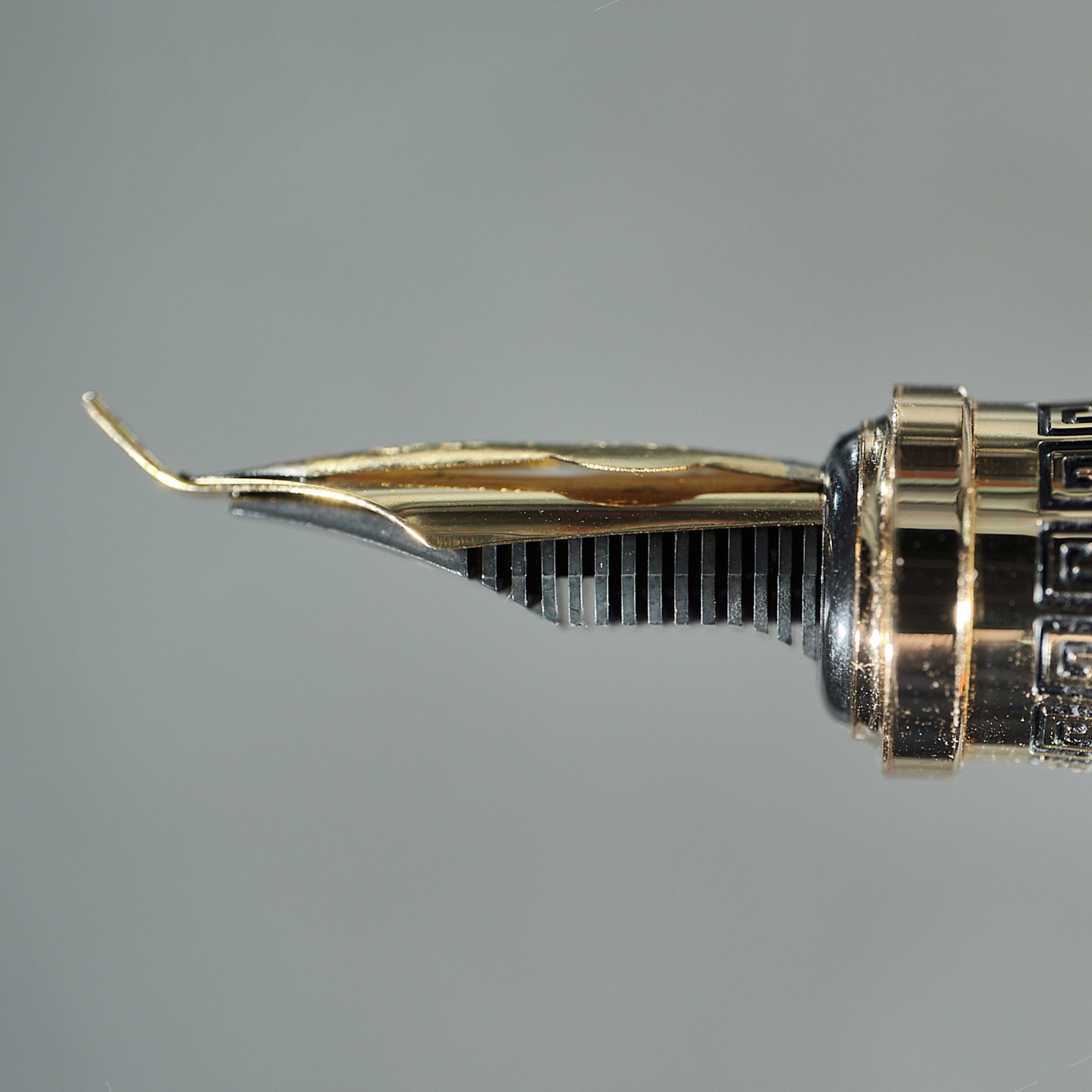
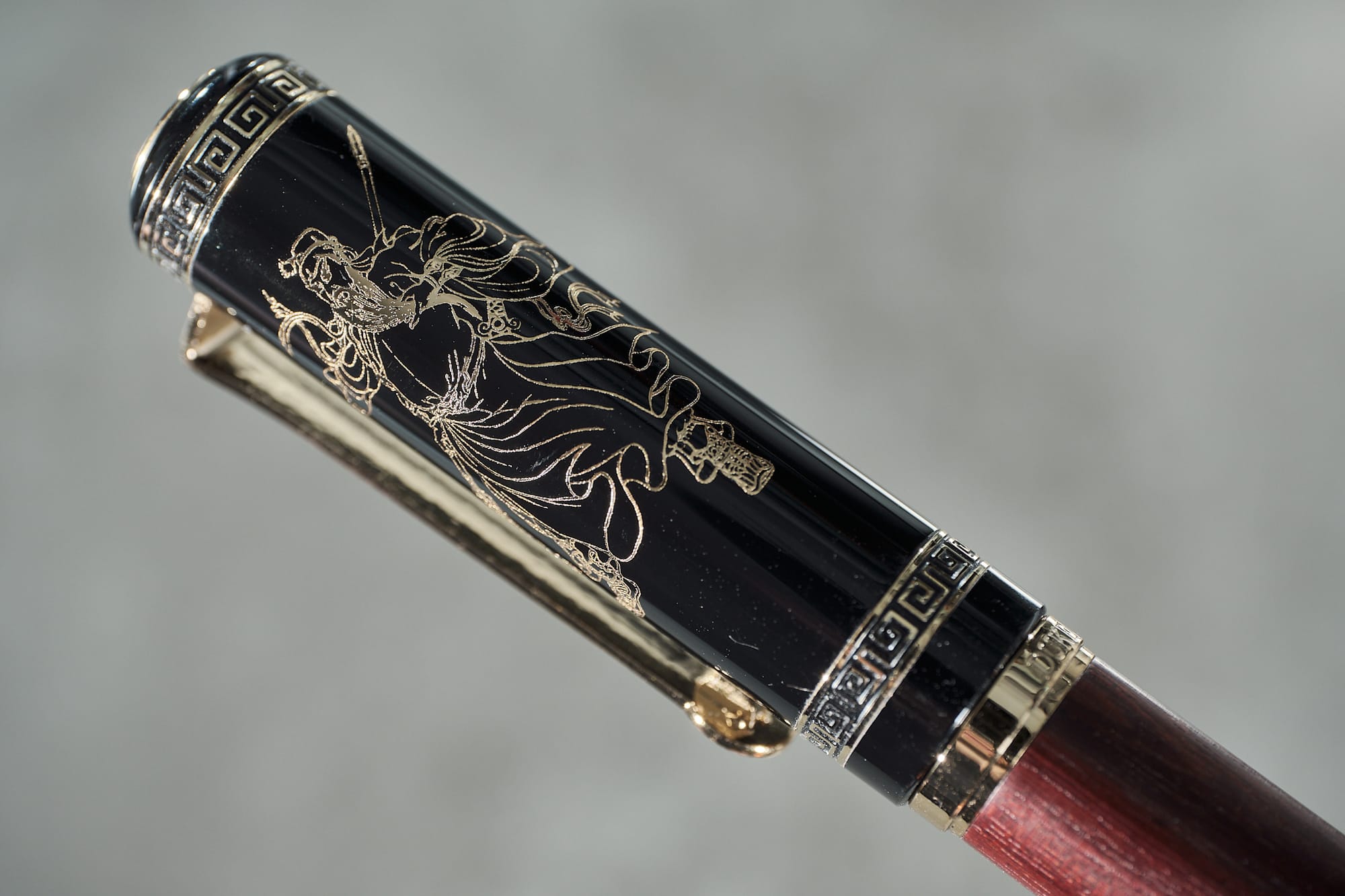
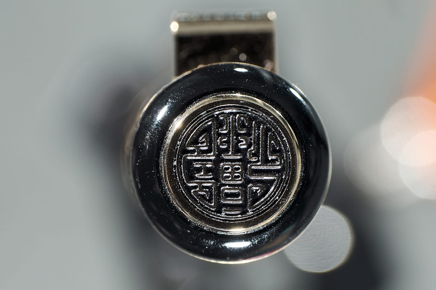
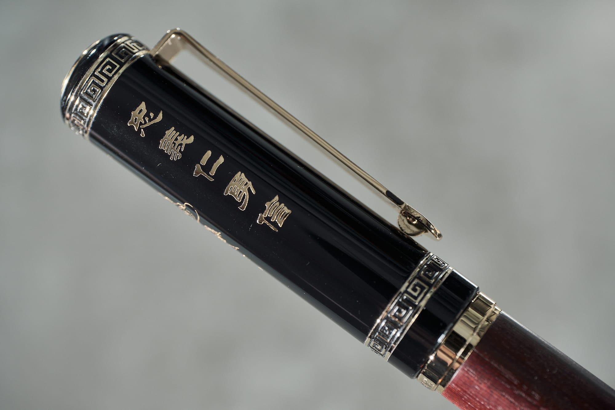
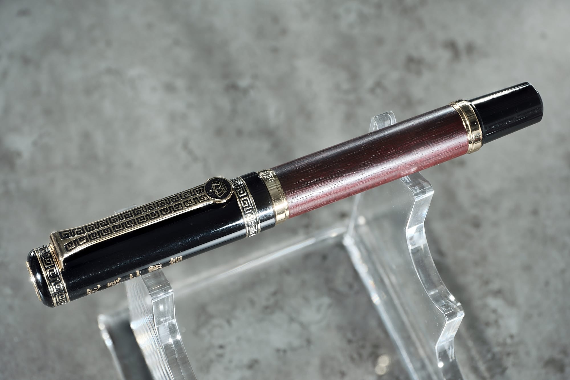
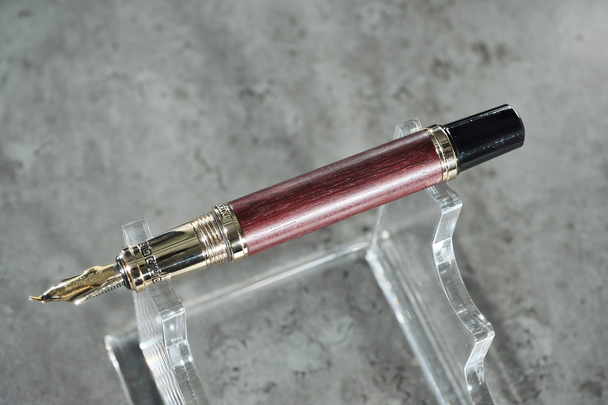
Duke are a Chinese brand that I'm fairly unfamiliar with. They have pens on AliExpress with RRP's ranging from super-budget sub £5 pens all the way up to "oh my god why does this pen cost £3000"?! This one was around the £35 mark when I bought it. I was initially drawn to this pen because of that honking great overfeed, but we'll talk more about the nib shortly. This is a pretty substantial pen at 149mm long capped, 14.5mm wide at the body, and 66.25g. It's made mostly from brass with what appears to be a Rosewood veneer on the barrel with the words "Duke" and "551" either side of the center band, and a plastic end finial. The overfeed has some Chinese script that reads "Special calligraphy tip", and on the cap we have an engraving of Confucius along with the Chinese words for "loyalty", "righteousness", "benevolence", "bravery", and "trustworthiness", which I believe are the five constant virtues in Confucianism. I'm not a particularly big fan of those parts, but I like the rest of the decoration on there, especially the cap finial, which looks a lot like a stylised Chinese Chop. But let's be clear here—the pen's philosophy & looks are mostly irrelevant. We're here for that weird-ass nib.
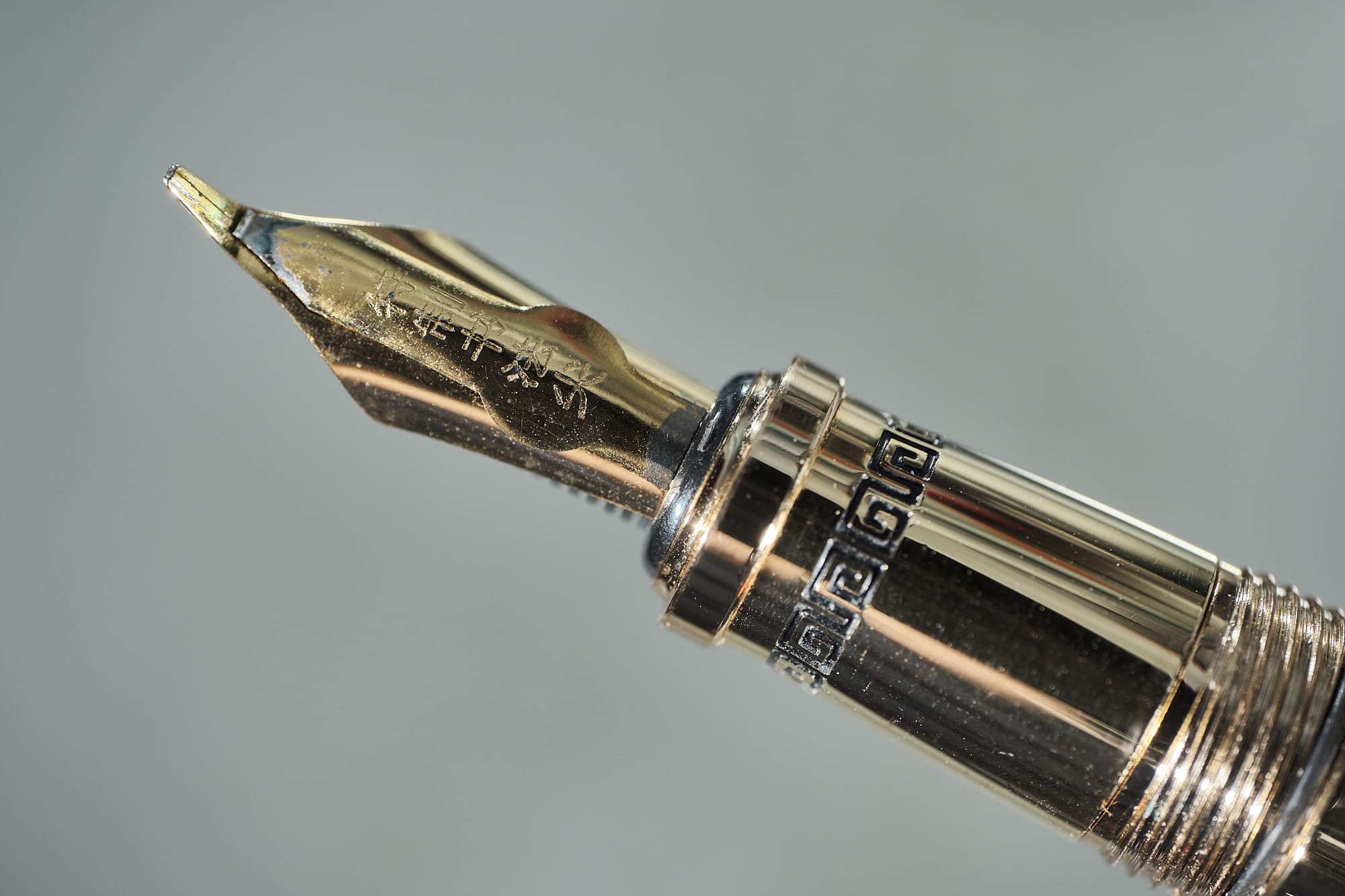
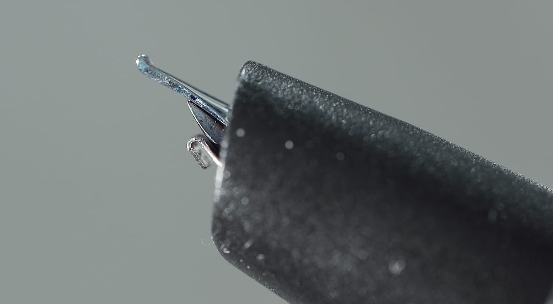
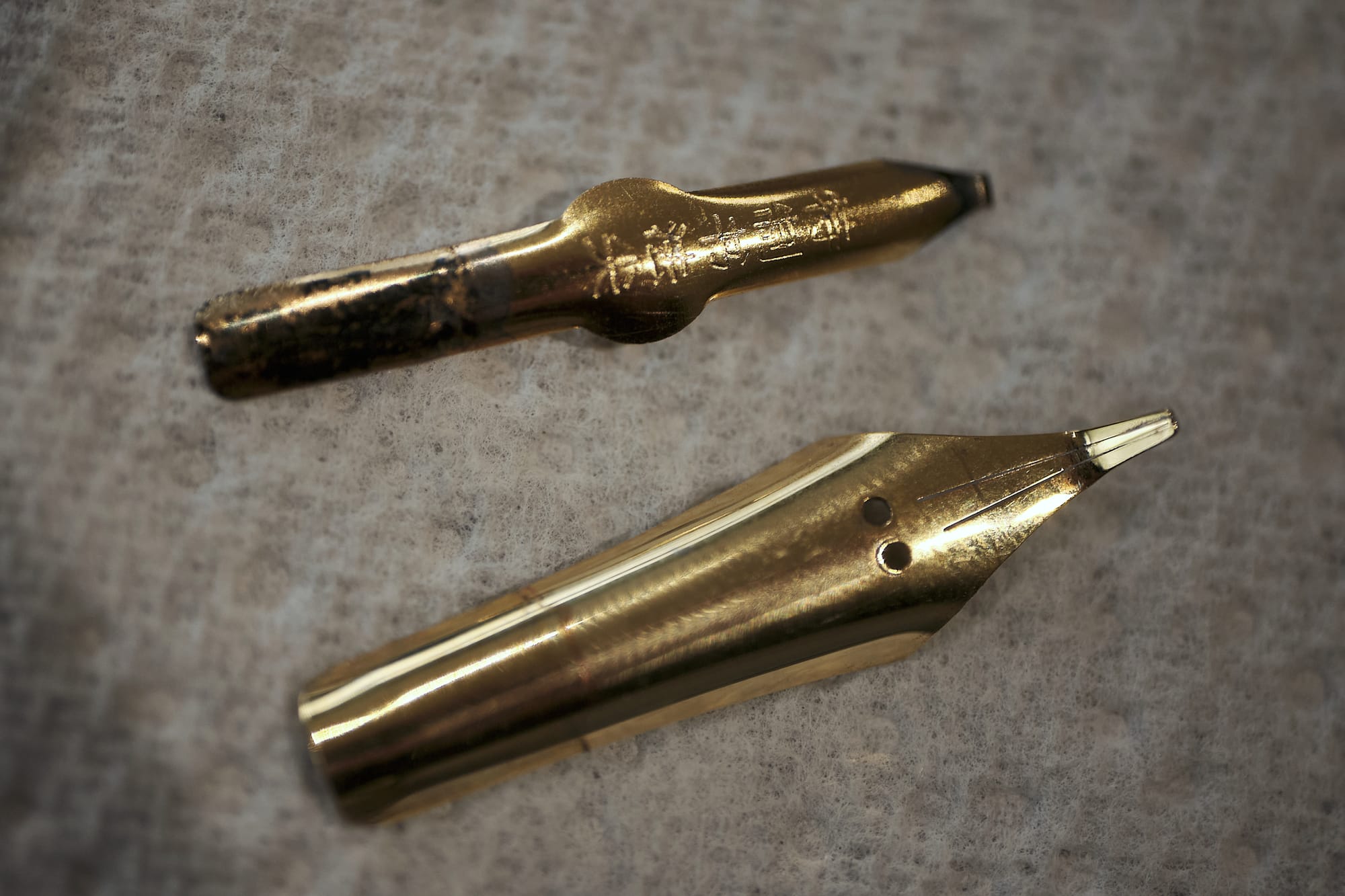
There are 3 main attributes to this #6 nib.
1) It has a very long Fude tip at 4mm
2) It has 3 tines instead of the usual 2
3) It has an overfeed
Parts 2 & 3 are both in service to part 1, helping to funnel more ink towards the tip. I'm not sure that both are strictly necessary. I feel like you could probably lose one and it'll still function fine, but I can't say for sure. It certainly makes for a much more interesting pen this way.
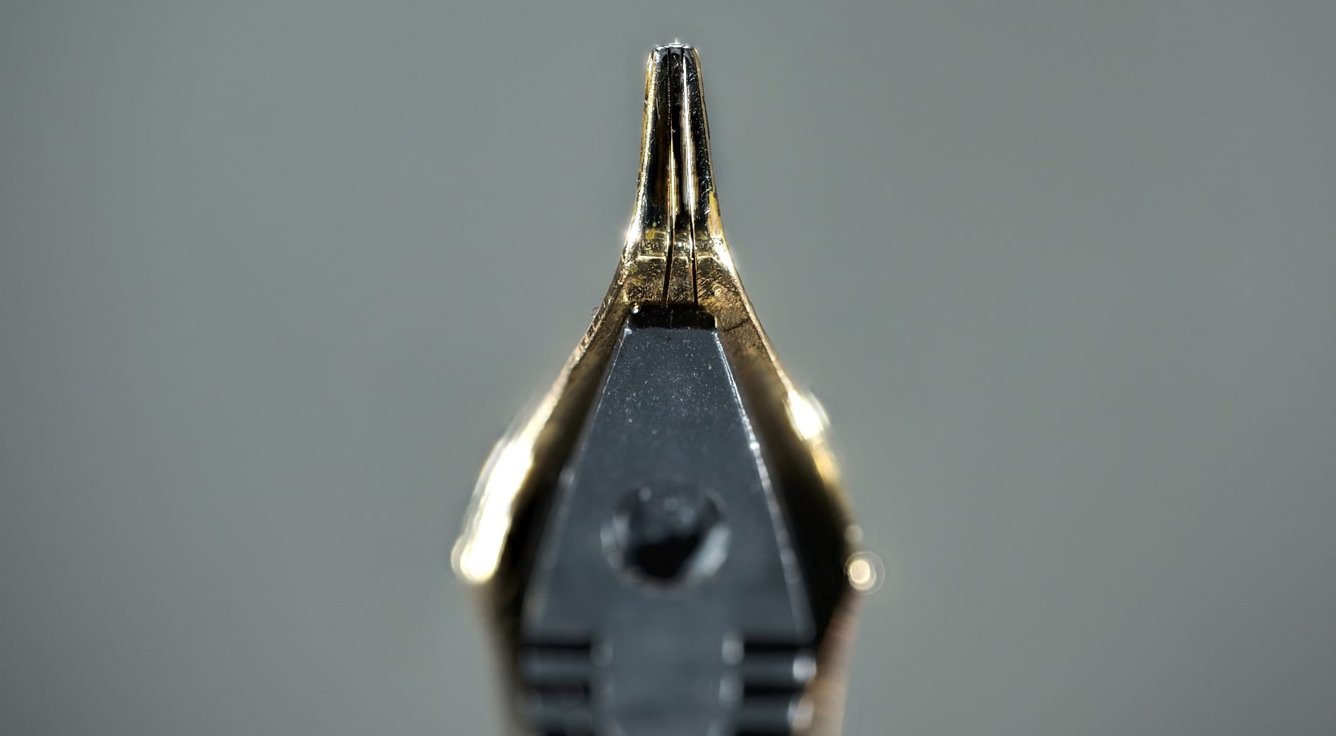
I've had the 551 for around 6 months now, and yet I only discovered that it has 3 tines at the end of January when I first started on this post (This was originally going to be a post about a bunch of different interesting Chinese pens I've gathered, before this revelation). No idea how I managed to completely miss that, but I didn't see it mentioned on any of the listings, plus the overfeed hides the slits completely, so you can only see that there are 2 slits if you're looking particularly closely at the tip. That's my excuse and I'm sticking to it.
So, what's it like to use? Well, considering I said this was a risk that paid off, it's pretty good. It feels comfortable in the hand, with the brass section adding much-needed weight to the front. This could also pose a problem, though, as the section has a polished finish that can be quite slippery. That's where the engraved pattern near the nib comes in. It provides just enough grip so that I've never had any problems with my fingers slipping. But, that only really works if you grip towards the front of the section. If you tend to grip further back, then you might run into some issues.
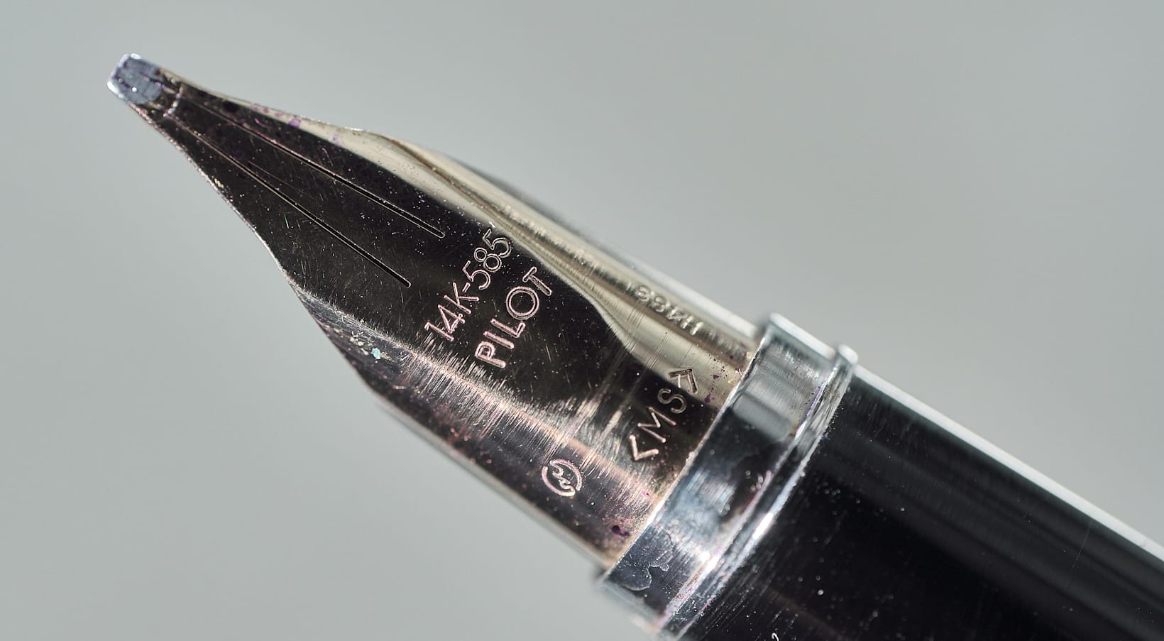
The nib itself is very smooth. You can get lines ranging from Extra Fine if you reverse the nib, all the way up to...uh...Quintuple Broad? Is that a thing? In real terms, lines vary from ~0.2mm to ~3.5mm. And because the tip of the nib is a bit wide, it writes like a stub when reversed or at very high angles. I've actually been enjoying using it reversed for everyday writing. I very much doubt this use case was considered when they were designing it, but they've done a good job of keeping it smooth and pretty forgiving. Although it's a heavy pen, a lot of that weight is in the cap. This does mean that if for some reason you decide to post the cap on the end—not that you would, right?—it will become very back-weighted. I wouldn't recommend doing this, though, as it does not post securely onto the black plastic finial unless you really squeeze it on, which will lead to gouge marks on the plastic over time. Speaking of balance: I'd say the (unposted) pen is weighted slightly back from centre. I haven't found any problems with this one, though, as the significant difference in length compared to the Majohn A3 means that it doesn't feel like it's being pulled down over the back of my hand. There's no danger of it lifting if you have a loose grip, unlike with the A3.
Is there anything I don't like about the pen? I'm not a fan of the barrel's plastic finial. It feels cheap compared to the rest of the pen, but I understand not wanting to add the extra weight to the back that a brass finial would bring. You may have noticed on some of these photos that the gold plating on the nib & overfeed is already flaking off, which doesn't look great. There is a version with silver trim & hardware, so this likely won't be a problem on that model. I've already mentioned I'm not a big fan of the Confucianism engravings on the cap, and the section could do with a different finish so that it's not as slippery. That's about it, though. I've enjoyed using it a lot, especially recently. It's very comfortable to hold, the wood—which is also available in Black Sandalwood, Tiger Wood, & Bamboo—feels nice, the nib is smooth & wet, and it copes very well with shimmer inks.
Now, the big question is: Do I recommend this pen? Music and Fude nibs are already niche as it is, so a combination of the two is super-niche. If you already enjoy using Fude nibs, I would absolutely recommend this one as it gives you strokes not possible with any other pen. If you're curious about Fude nibs but have never used one, I would probably suggest trying out either the Sailor Hocoro dip pen with the Fude nib, or something like a Jinhao 82 or 100 which can be found with Fude nib options. Both of these are a cheaper option to try it out and see if you like this style of nib. If it turns out Fude is your jam, then have at it! I just think this is just a bit too specific for most people. But, it is a very weird pen, and I love to highlight pens that are somewhat outside of the norm.
Has this pen got you interested in Fude or even Music nibs? Let me know in the comments!